my current show is a bit eccentric…
As long as I can remember, I’ve been intrigued by the stone objects that are an integral part of traditional Japanese gardens. I find the best of them compelling in a purely sculptural… Continue reading

As long as I can remember, I’ve been intrigued by the stone objects that are an integral part of traditional Japanese gardens. I find the best of them compelling in a purely sculptural… Continue reading
Remember the smell? The scratchy sound of the yellow and green cardboard flap folding back in a pixelated-spectrum-reveal? Which do you choose first? The joy of that short-lived, sharp-crayon-newness; the fuzziness of… Continue reading
There’s the initial start at not being alone in a room when you thought you were, followed by confusion as to what exactly it is you’re seeing. Next you’re awestruck. Really, what is… Continue reading
is a group show i’ve curated… an homage to the novel and meditation on its continuing relevance. here’s my curatorial statement: 2018 is the bicentennial of Mary Wollstonecraft Shelley’s novel, Frankenstein; or, The Modern… Continue reading
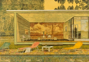
we’ll open a show of stefan kurten’s newest paintings tomorrow. here’s my read on it: in stefan kürten’s aestheticized architectural images,there is nearly always a reflection: in a pool, a plate glass window,… Continue reading
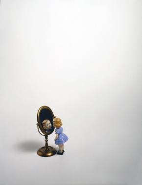
Mirror I am silver and exact. I have no preconceptions. Whatever I see I swallow immediately Just as it is, unmisted by love or dislike. I am not cruel, only truthful-… Continue reading
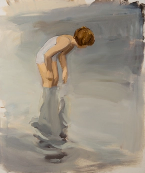
The first mirror — likely a pool of still water — allowed humans to see themselves as others did. Later came polished surfaces — copper, bronze, silver, pyrite, even stone — though the quality of… Continue reading
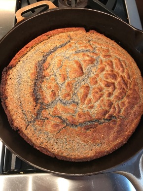
the crisped-crunchy crust and moist-crumbly interior of cast iron skillet baked cornbread can’t be beat. here’s my recipe. blue cornmeal makes a more flavorful loaf that is healthier, holds together better… Continue reading
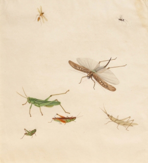
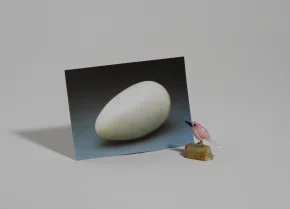
liliana porter juxtaposes incongruous objects, heavy with references to art history, in a witty and formally simple — but masterfully complex — play on the existential conundrum: which came first, the chicken or… Continue reading
i’ll post images and texts of individual works, but first, my curatorial statement. What I’ve Learned So Far I believe that art must surprise and charm, be so beautiful, so mesmerizing, so technically… Continue reading
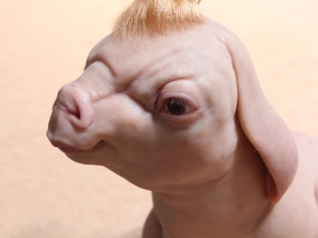
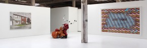
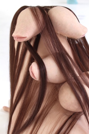
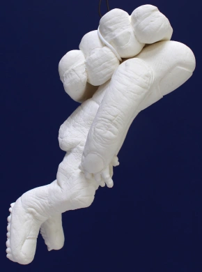
patricia piccinini’s work is often not easy to look at, but it affects us profoundly. it is grotesque, shocking and disturbing at the same time that it’s poetic, tender, compassionate and beautiful. … Continue reading
i finally finished the curatorial statement for our show… here it is: People have always interpreted their environment by measuring themselves against it. The oldest units of measure were based on the body:… Continue reading
about the installation of his exhibition garden variety… dianne dec: The installation has gone through a number of changes since you’ve been here – what are you most surprised about? tim hawkinson: I… Continue reading
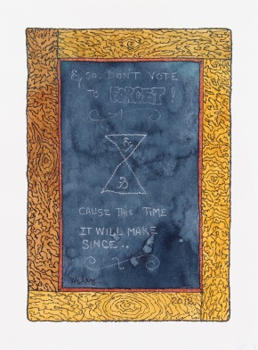
from william t. wiley: don’t vote to forget! cause this time it will make since…
my friend david breskin is posting a poem-a-day in this season of insanity. election-season sense about nonsense. check it out at: 7-eleven poems
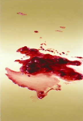
here’s my introduction to the work: In this survey of work made over the last fifteen years, Cornelius Völker’s oeuvre reveals a uniquely contemporary investigation of the history of representational painting, based primarily… Continue reading
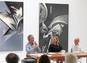
at hosfelt gallery, with julian cox and veronica roberts, moderated by todd hosfelt: Todd Hosfelt: Thank you all for coming. We are so lucky to have two really smart and insightful people… Continue reading